Introduction
The median is an important quantity in data analysis. It represents the middle value of a data distribution. Estimates of the median, however, have a degree of uncertainty because (a) they are calculated from a finite sample and (b) the underlying data distribution is generally unknown. One important role of a data scientist is to quantify and communicate the degree of uncertainty in an analysis.
In this post, we will use simulation to find which quantiles of a distribution can be estimated more precisely.
library(tidyverse)
library(reshape2)
Standard Normal Distribution
First, we need to set up the initial parameters. For every simulation process, we will generate 200 values based on the standard normal distribution, and we will repeat the process 5,000 times.
Therefore, set the sample size to 200 and the number of tests to 5,000.
sample_size <- 200
test_num <- 5000
Then let’s create a function to find the quantile values for each test and output them as sequences.
find_quantile_value <- function(fn,sample_size, quantile_position){
  sample <- fn(sample_size)
  qtseq <- quantile(sample, seq(0.05,0.95,0.05))
  qtseq[[quantile_position]]
}
To store the values of each quantile, we can create a data frame. Since there are 19 quantiles and 5,000 tests, the data frame should be a 5000*19 table. Then use a for loop to traverse each test and each quantile.
sml_results <- as.data.frame(matrix(NA, nrow = test_num, ncol = 19))

for(i in 1:nrow(sml_results)){
  for(q in 1:ncol(sml_results)){
    sml_results[i,q] <- find_quantile_value(rnorm,sample_size, q)
  }
}
Now we need to find the length of the middle 95% interval for the distribution of each quantile value.
length_list <- rep(NA,ncol(sml_results))
for(q in 1:ncol(sml_results)){
  quantile_2.5_97.5<- quantile(sml_results[,q], c(0.025, 0.975))
  length_list[q] <- quantile_2.5_97.5[[2]]-quantile_2.5_97.5[[1]]
}
Save the data obtained above into a data frame and plot it.
length_df <- as.data.frame(matrix(ncol = 2, nrow = length(length_list)))
names(length_df) <- c("quantile_position","mid95_length")
length_df[,1] <- seq(0.05,0.95,0.05)
length_df[,2] <- length_list
ggplot(length_df,aes(x=quantile_position,y=mid95_length))+
  geom_point()+geom_line()+
  labs(title = "Length of middle 95% of normal distribution")+
  scale_x_continuous(
    name = "pth quantile",
    breaks = seq(0.05, 0.95, 0.05)
  )+
  scale_y_continuous(name = "Length")

As we can see, when the quantile approaches 50%, the length decreases. This means the simulation error is lower near the 50% quantile. In other words, the 50% quantile has the best precision.
In other words, when the quantile is 50%, the median has the tightest sampling distribution.
Then, we need to transfer the x-axis from quantile to the density values of the original distribution. In this part, it should be a standard normal distribution.
length_d_df <- length_df %>%
  mutate(density=dnorm(qnorm(quantile_position)))

ggplot(length_d_df, aes(x=density,y=mid95_length))+
  geom_point()+geom_line()+
  labs(title = "Length of middle 95% of normal distribution by density", x= "Density",y="Length")
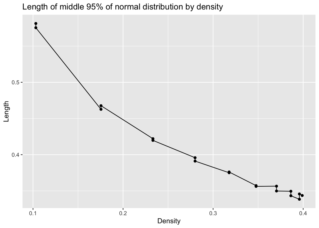
In this graph, we can see that when density is higher, the simulation error is lower.
Exponential Distribution
Distribution 2 is the exponential distribution with rate = 1.
As we did before, calculate the values for each quantile and each test, then plot the graph.
for(i in 1:nrow(sml_results)){
  for(q in 1:ncol(sml_results)){
    sml_results[i,q] <- find_quantile_value(rexp,sample_size, q)
  }
}

length_list <- rep(NA,ncol(sml_results))
for(q in 1:ncol(sml_results)){
  quantile_2.5_97.5<- quantile(sml_results[,q], c(0.025, 0.975))
  length_list[q] <- quantile_2.5_97.5[[2]]-quantile_2.5_97.5[[1]]
}

length_df <- as.data.frame(matrix(ncol = 2, nrow = length(length_list)))
names(length_df) <- c("quantile_position","mid95_length")
length_df[,1] <- seq(0.05,0.95,0.05)
length_df[,2] <- length_list
ggplot(length_df,aes(x=quantile_position,y=mid95_length))+
  geom_point()+geom_line()+
  labs(title = "Length of middle 95% of exponential distribution")+
  scale_x_continuous(
    name = "pth quantile",
    breaks = seq(0.05, 0.95, 0.05)
  )+
  scale_y_continuous(name = "Length")

For this exponential distribution, as the quantile increases, the simulation error also increases.
In other words, the 5% quantile has the tightest sampling distribution.
And when the density is higher, the error is smaller.
length_d_df <- length_df %>%
  mutate(density=dexp(qexp(quantile_position)))

ggplot(length_d_df, aes(x=density,y=mid95_length))+
  geom_point()+geom_line()+
  labs(title = "Length of middle 95% of exponential distribution by density", x= "Density",y="Length")

Mixture Distribution 3
Distribution 3 is a mixture distribution defined by these functions.
rf3 <- function(N){
  G <- sample(0:2, N, replace = TRUE, prob = c(5,3,2))
  (G==0)*rnorm(N) + (G==1)*rnorm(N,4) + (G==2)*rnorm(N,-4,2)
}

pf3 <- function(x){
  .5*pnorm(x) + .3*pnorm(x,4) + .2*pnorm(x,-4,2)
}

df3 <- function(x){
  .5*dnorm(x) + .3*dnorm(x,4) + .2*dnorm(x,-4,2)
}
And just like we did in previous chunks, plot the length of the middle 95% interval for the quantiles.
for(i in 1:nrow(sml_results)){
  for(q in 1:ncol(sml_results)){
    sml_results[i,q] <- find_quantile_value(rf3,sample_size, q)
  }
}

length_list <- rep(NA,ncol(sml_results))
for(q in 1:ncol(sml_results)){
  quantile_2.5_97.5<- quantile(sml_results[,q], c(0.025, 0.975))
  length_list[q] <- quantile_2.5_97.5[[2]]-quantile_2.5_97.5[[1]]
}

length_df <- as.data.frame(matrix(ncol = 2, nrow = length(length_list)))
names(length_df) <- c("quantile_position","mid95_length")
length_df[,1] <- seq(0.05,0.95,0.05)
length_df[,2] <- length_list
ggplot(length_df,aes(x=quantile_position,y=mid95_length))+
  geom_point()+geom_line()+
  labs(title = "Length of middle 95% of given mixture distribution 3")+
  scale_x_continuous(
    name = "pth quantile",
    breaks = seq(0.05, 0.95, 0.05)
  )+
  scale_y_continuous(name = "Length")

When the quantile is 40%, it has the tightest sampling distribution.
We do not have the qf3 function, so we need to use the pf3 function to calculate the values for each corresponding quantile. The rest is the same as in the previous chunks.
pf3 <- function(x){
  .5*pnorm(x) + .3*pnorm(x,4) + .2*pnorm(x,-4,2)
}

quantile_seq <- seq(0.05,0.95,0.05)
qf3_seq <- rep(NA, length(quantile_seq))
for(i in seq_along(quantile_seq)){
qf3_seq[i] <- uniroot(function(x){pf3(x)-quantile_seq[i]}, c(-100,100))[[1]]
}

length_d_df <- length_df %>%
  mutate(density=df3(qf3_seq))

ggplot(length_d_df, aes(x=density,y=mid95_length))+
  geom_point()+geom_line()+
  labs(title = "Length of middle 95% of given mixture distribution 3 by density", x= "Density",y="Length")

Mixture Distribution 4
Mixture Distribution 4 is the following mixture distribution.
rf4 <- function(N){
  G <- sample(0:1, N, replace = TRUE)
  (G==0)*rbeta(N,5,1) + (G==1)*rbeta(N,1,5)
}
As in previous chunks, we can plot the length of each quantile.
for(i in 1:nrow(sml_results)){
  for(q in 1:ncol(sml_results)){
    sml_results[i,q] <- find_quantile_value(rf4,sample_size, q)
  }
}

length_list <- rep(NA,ncol(sml_results))
for(q in 1:ncol(sml_results)){
  quantile_2.5_97.5<- quantile(sml_results[,q], c(0.025, 0.975))
  length_list[q] <- quantile_2.5_97.5[[2]]-quantile_2.5_97.5[[1]]
}

length_df <- as.data.frame(matrix(ncol = 2, nrow = length(length_list)))
names(length_df) <- c("quantile_position","mid95_length")
length_df[,1] <- seq(0.05,0.95,0.05)
length_df[,2] <- length_list
ggplot(length_df,aes(x=quantile_position,y=mid95_length))+
  geom_point()+geom_line()+
  labs(title = "Length of middle 95% of given mixture distribution 4")+
  scale_x_continuous(
    name = "pth quantile",
    breaks = seq(0.05, 0.95, 0.05)
  )+
  scale_y_continuous(name = "Length")

When the quantile is 5% or 95%, the sampling distribution is the tightest.
Based on the rf4 function we already have, we can write the pf4 and df4 functions. After that, we use the same method to plot the graph.
rf4 <- function(N){
  G <- sample(0:1, N, replace = TRUE)
  (G==0)*rbeta(N,5,1) + (G==1)*rbeta(N,1,5)
}

pf4 <- function(x){
  .5*pbeta(x,5,1) + .5*pbeta(x,1,5)
}

df4 <- function(x){
  .5*dbeta(x,5,1) + .5*dbeta(x,1,5)
}

quantile_seq <- seq(0.05,0.95,0.05)
qf4_seq <- rep(NA, length(quantile_seq))
for(i in seq_along(quantile_seq)){
qf4_seq[i] <- uniroot(function(x){pf4(x)-quantile_seq[i]}, c(-100,100))[[1]]
}


length_d_df <- length_df %>%
  mutate(density=df4(qf4_seq))

ggplot(length_d_df, aes(x=density,y=mid95_length))+
  geom_point()+geom_line()+
  labs(title = "Length of middle 95% of given mixture distribution 4 by density", x= "Density",y="Length")

Other Tests
In this part, we will focus on situations where the sample size becomes 400, 800, and 1600.
Now use a for loop to generate all the data for different sample sizes.
sample_size <- c(400,800,1600)
test_num <- 5000

length_df <- as.data.frame(matrix(ncol = 1+length(sample_size), nrow = length(length_list)))
names(length_df) <- c("quantile_position","400_mid95_length","800_mid95_length","1600_mid95_length")
length_df[,1] <- seq(0.05,0.95,0.05)

for(n in seq_along(sample_size)){

  sml_results <- as.data.frame(matrix(NA, nrow = test_num, ncol = 19))

  for(i in 1:nrow(sml_results)){
    for(q in 1:ncol(sml_results)){
      sml_results[i,q] <- find_quantile_value(rnorm,sample_size[n], q)
    }
  }

  length_list <- rep(NA,ncol(sml_results))
  for(q in 1:ncol(sml_results)){
    quantile_2.5_97.5<- quantile(sml_results[,q], c(0.025, 0.975))
    length_list[q] <- quantile_2.5_97.5[[2]]-quantile_2.5_97.5[[1]]
  }

  length_df[,1+n] <- length_list
}
Then plot the graphs for different sample sizes and compare them.
length_df %>%
  melt(id = "quantile_position") %>%
  ggplot()+
  geom_line(aes(x=quantile_position,y=value,color=variable))+
  labs(title = "Length of middle 95% of normal distribution given different sample sizes", y = "Length")+
  scale_x_continuous(
    name = "pth quantile",
    breaks = seq(0.05, 0.95, 0.05)
  )

length_df %>%
  mutate(density=dnorm(qnorm(quantile_position))) %>%
  select(-quantile_position) %>%
  melt(id = "density") %>%
  ggplot()+
  geom_line(aes(x=density,y=value,color=variable))+
  labs(title = "Length of middle 95% of normal distribution given different sample sizes", y = "Length")+
  scale_x_continuous(
    name = "pth quantile",
    breaks = seq(0.05, 0.95, 0.05)
  )

When the sample size is larger, the simulation error becomes smaller.
In summary, as the sample size increases, the length becomes smaller, which means the simulation error is lower than before.